Pora Mate
Pora Mate is a homegrown Paraguayan yerba mate brand that bridges cultural heritage with contemporary design sensibilities. Originating from a small local shop and deeply connected to Paraguay’s traditions, the brand carries forward the spirit of community and vitality that defines mate culture. For its launch, three core flavors were developed as the foundation of its identity, each supported by a visual system that blends retro-inspired typography, bold illustration, and a carefully curated premium color palette. Together, these elements establish Pora Mate not only as a beverage but as a lifestyle brand. They strive o be a household name that embodies authenticity, celebrates creativity, and inspires a vibrant way of living both in its home country and as it expands into new markets.
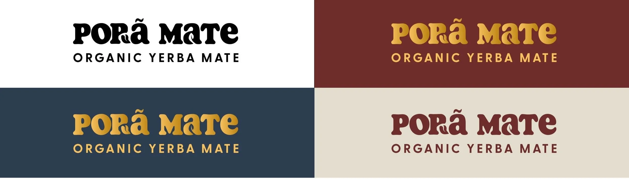
Wordmark
The Pora Mate wordmark is designed for versatility, functioning seamlessly in both black and white applications. For the launch of the first three flavors, the mark is also expressed in a bold gold and red palette, introducing vibrancy and distinction while maintaining overall brand consistency.
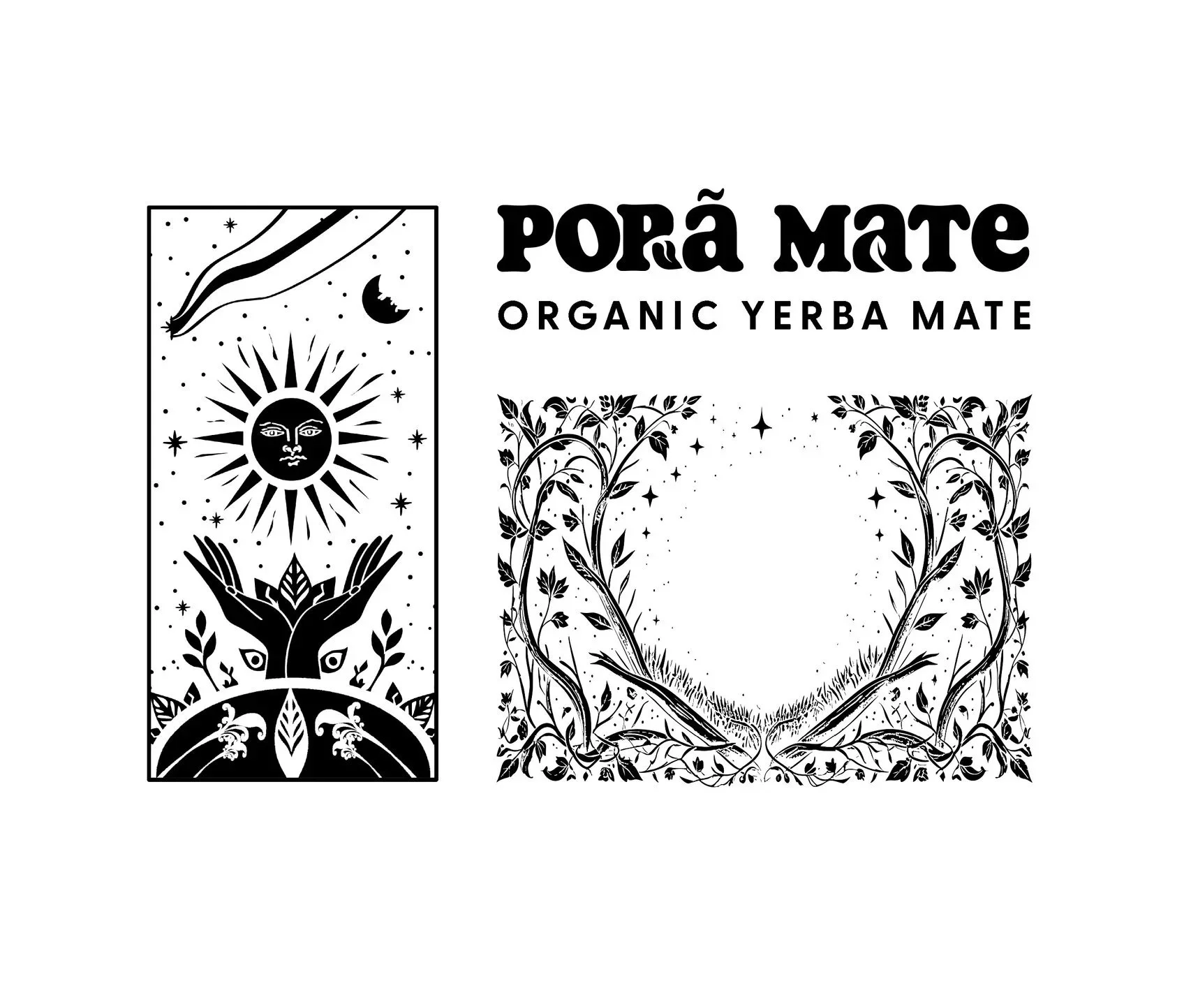
Key Visuals
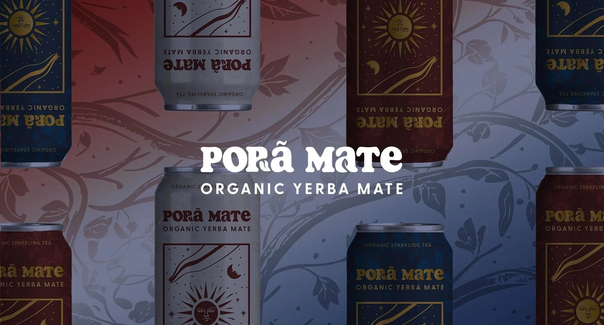
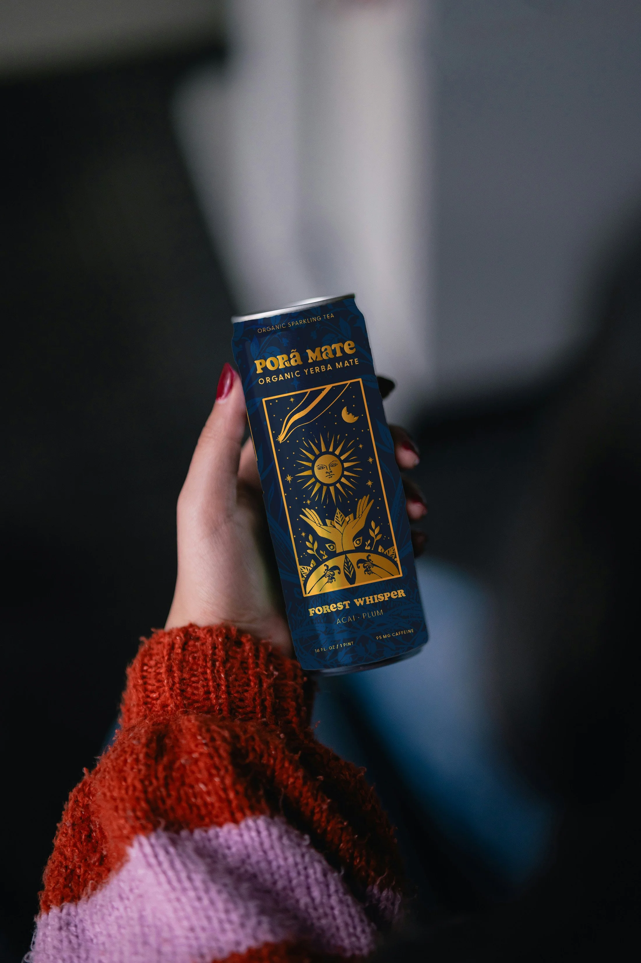
The hero image was designed with versatility at its core, serving both to make the can visually striking and to translate seamlessly onto merchandise. Rooted in the brand’s connection to a family history in printing, the illustration and accompanying tone-on-tone pattern were carefully crafted for adaptability. The pattern was intentionally developed so that stretching or scaling would create natural deformation, ensuring it maintains visual interest and consistency whether applied to cans, apparel, or broader print materials.
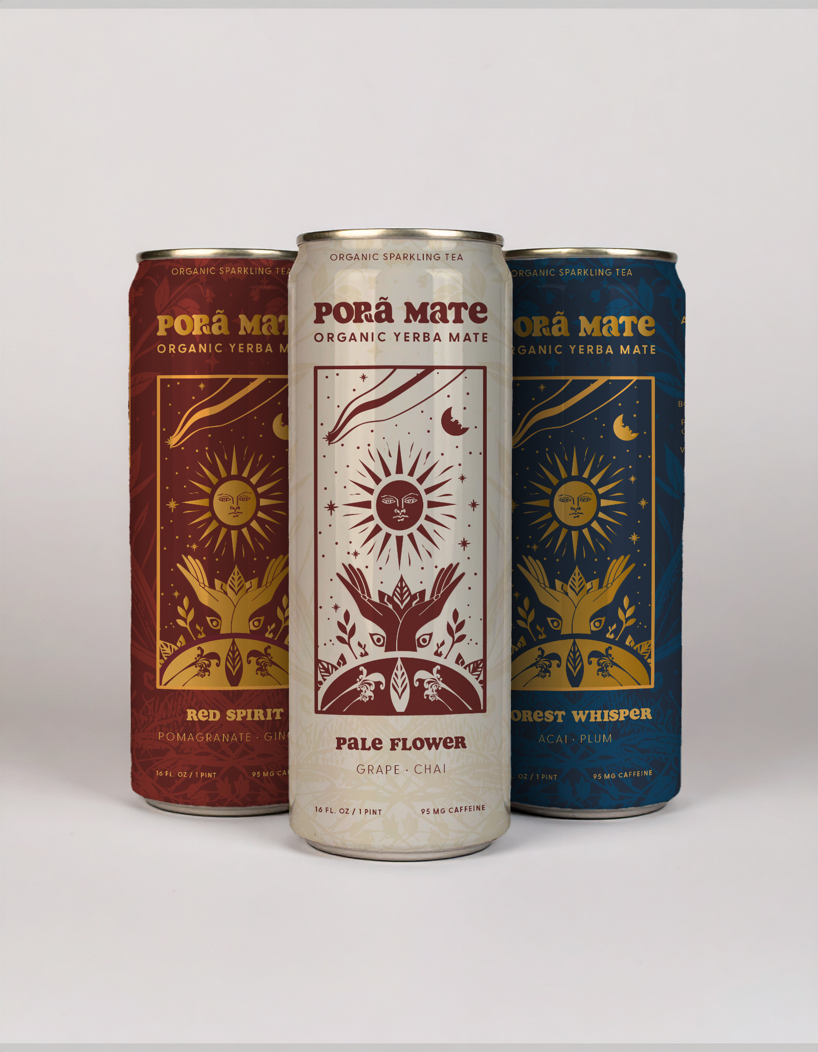
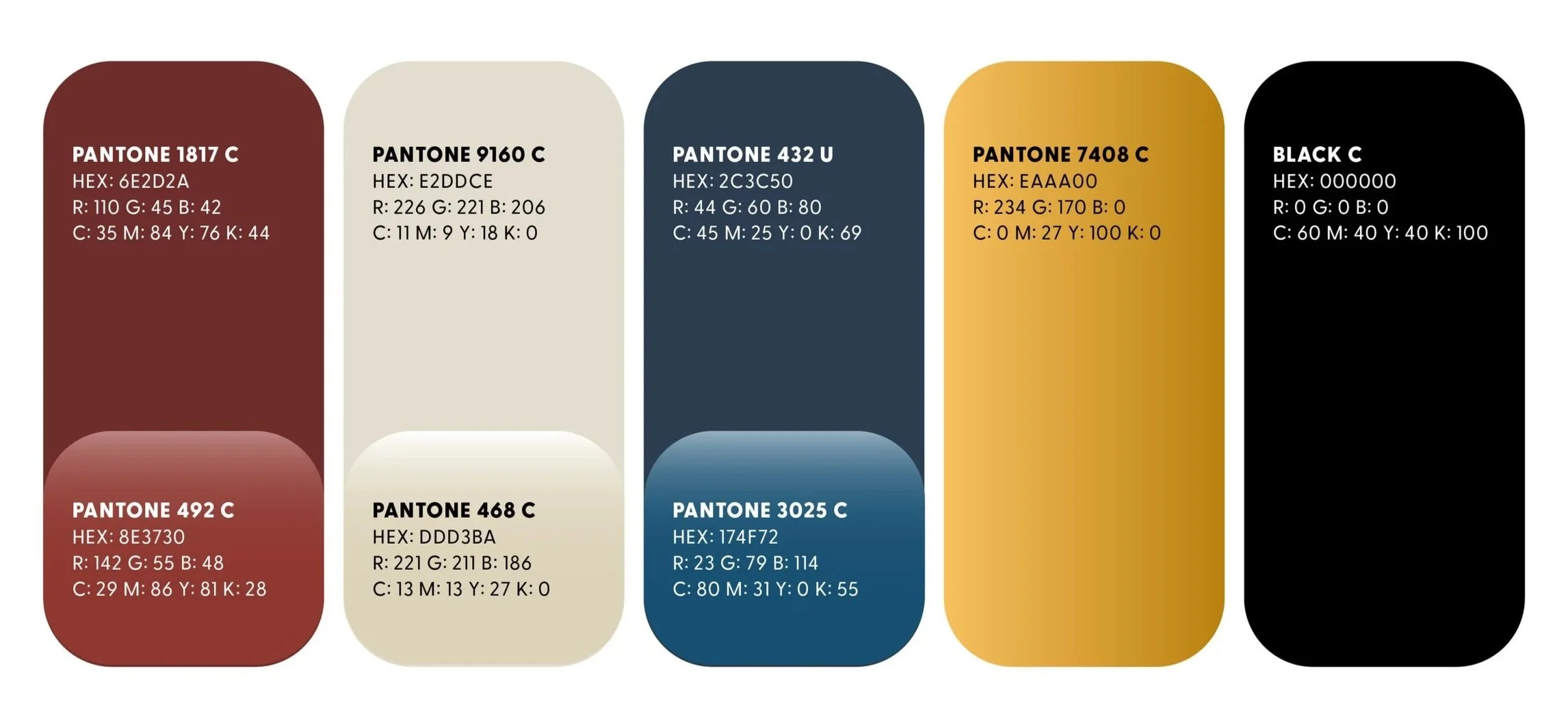
Brand Color
The brand colors were carefully selected and tested to ensure consistent performance across multiple applications and styles. Each core tone was evaluated in flat color form, as tone-on-tone patterns, and within gradient treatments to confirm adaptability and visual impact. The palette was also tested across both digital and print platforms, guaranteeing that the colors maintain their vibrancy, clarity, and premium feel regardless of medium or context. This rigorous approach ensures that whether applied on packaging, merchandise, or campaign materials, the colors remain true to the brand’s identity while offering flexibility for creative expression.
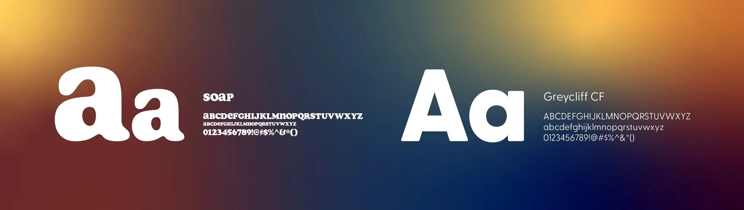
Type & Lettering
The primary Pora Mate wordmark is set in the typeface Soap, chosen for its ability to capture the expressive, character-rich aesthetic of 1970s design. Subtle leaf accents were integrated into the letterforms to introduce a sense of playfulness and reinforce the brand’s connection to nature. To balance this retro influence, Greycliff CF was selected as the supporting typeface, providing a modern, spacious feel that enhances readability. In application, Soap is reserved exclusively for the “Pora Mate” mark and for use in titles across point-of-sale and presentation materials, while Greycliff CF serves as the primary typeface for body copy and extended text to ensure maximum legibility across all platforms.
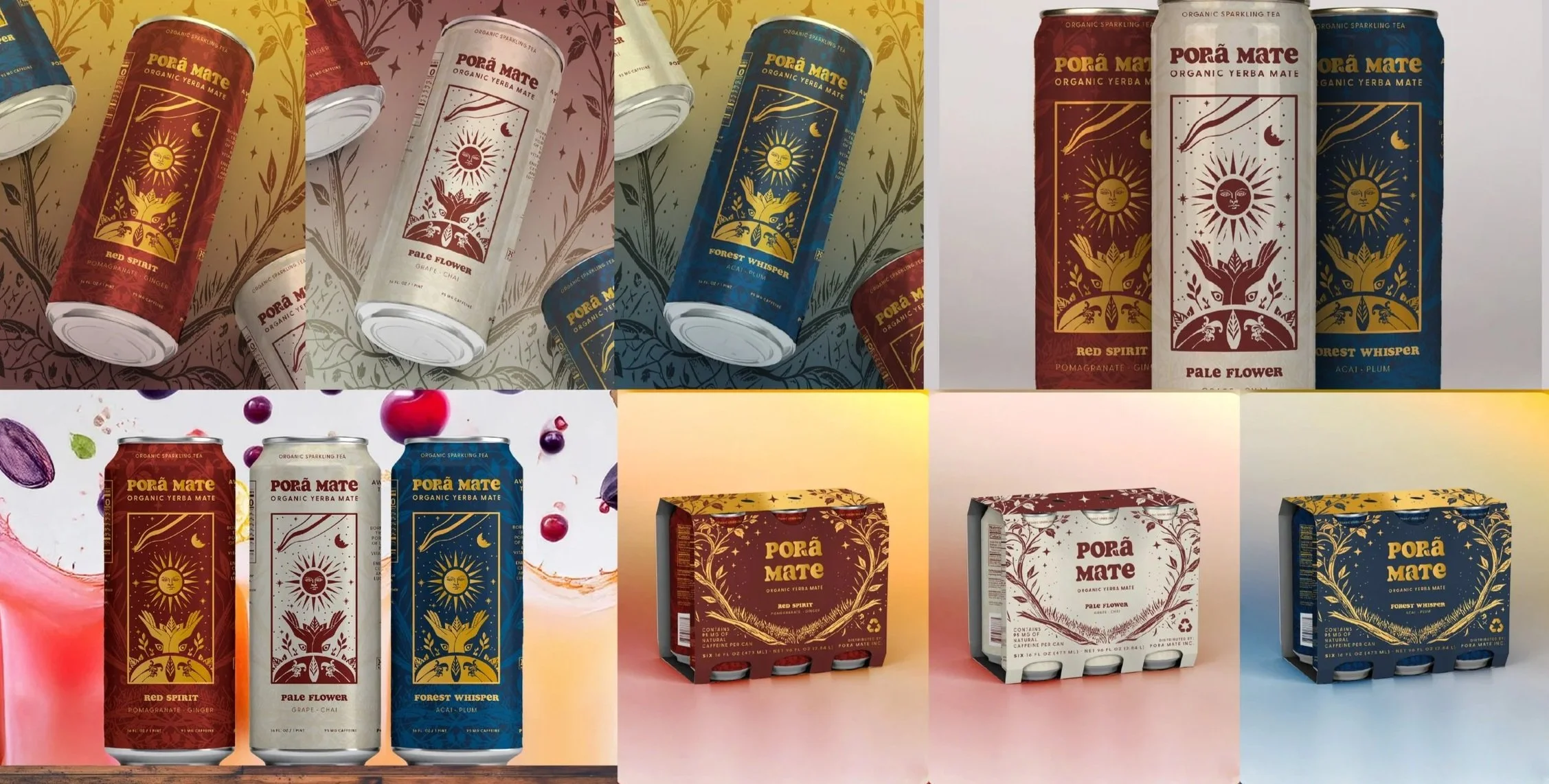
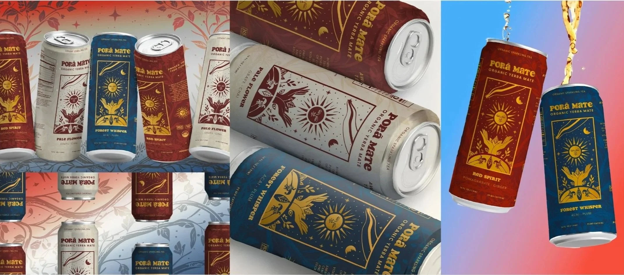
Brand Vision
The key visual renders demonstrate a variety of ways the core cans can be applied across brand touchpoints. In addition to the cans themselves, the system extends to packaging concepts such as an open six-pack case designed for both retail and wholesale environments, ensuring consistency across shelf displays and bulk sales. The core colors and imagery are further explored across lifestyle applications, including apparel, phone cases, and branded skate and surf gear, reinforcing the brand’s cultural presence beyond the beverage itself. Each render highlights the adaptability of the visual identity, showing how tone-on-tone patterns, hero illustrations, and wordmark treatments can be scaled and repurposed without losing impact. This approach underscores the versatility of the brand system, illustrating its potential not only for packaging and merchandise but also for broader campaign executions, events, and community collaborations.